Colours and combinations for furnishing in 2023
Colour combinations: which ones to focus on for interior design in 2023?
The solutions concerning trendy colour combinations in 2023 are among the most varied. From colours inspired by nature, such as green, to more subdued and neutral shades such as taupe, here are the nuances to focus on when furnishing a new home or renewing the look of the rooms in your home.
Colour matching: trendy solutions
Trendy colour matching solutions in 2023 meet the need and desire to regain peace and serenity, states of mind lost due to the pandemic and the ongoing war, at least in one’s own home. In fact, the most popular colours are those capable of recreating a relaxing and energising atmosphere at the same time, perfect for illuminating rooms. Beautiful hues that look great in home furnishings. Palettes characterised by great conventional contradictions, to fully express one’s individuality and personalise one’s home to the maximum.
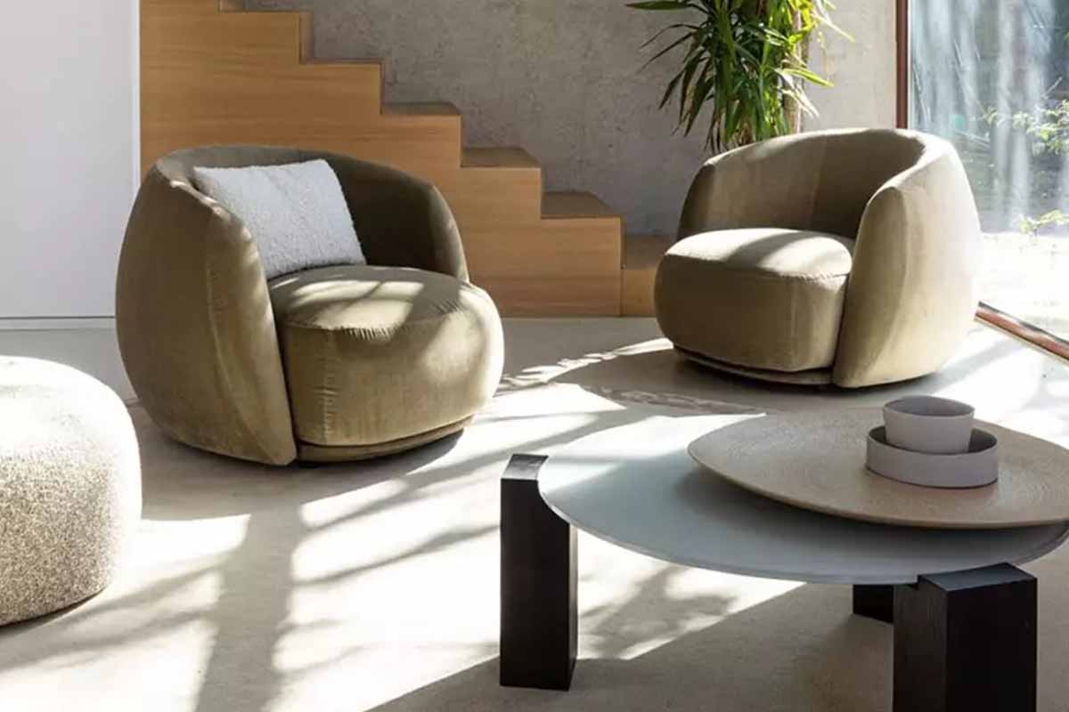
Colour combinations for furnishing in 2023 – pacific moroso armchair – Arredare Moderno
Ideas for using Viva Magenta in interior design
Viva Magenta, a special shade of red inspired by nature, is the Pantone colour of the year. It goes very well with both warm and cool tones. Moreover, being a truly energising colour it suits a wide range, materials, textures and surfaces in any room of the home, from the living room to the bathroom. In fact, introducing this colour into your home, whether by painting a wall, or simply inserting an element such as an armchair, creates a seductive atmosphere and gives the rooms in which it is used an unconventional accent that will also impress friends and family.
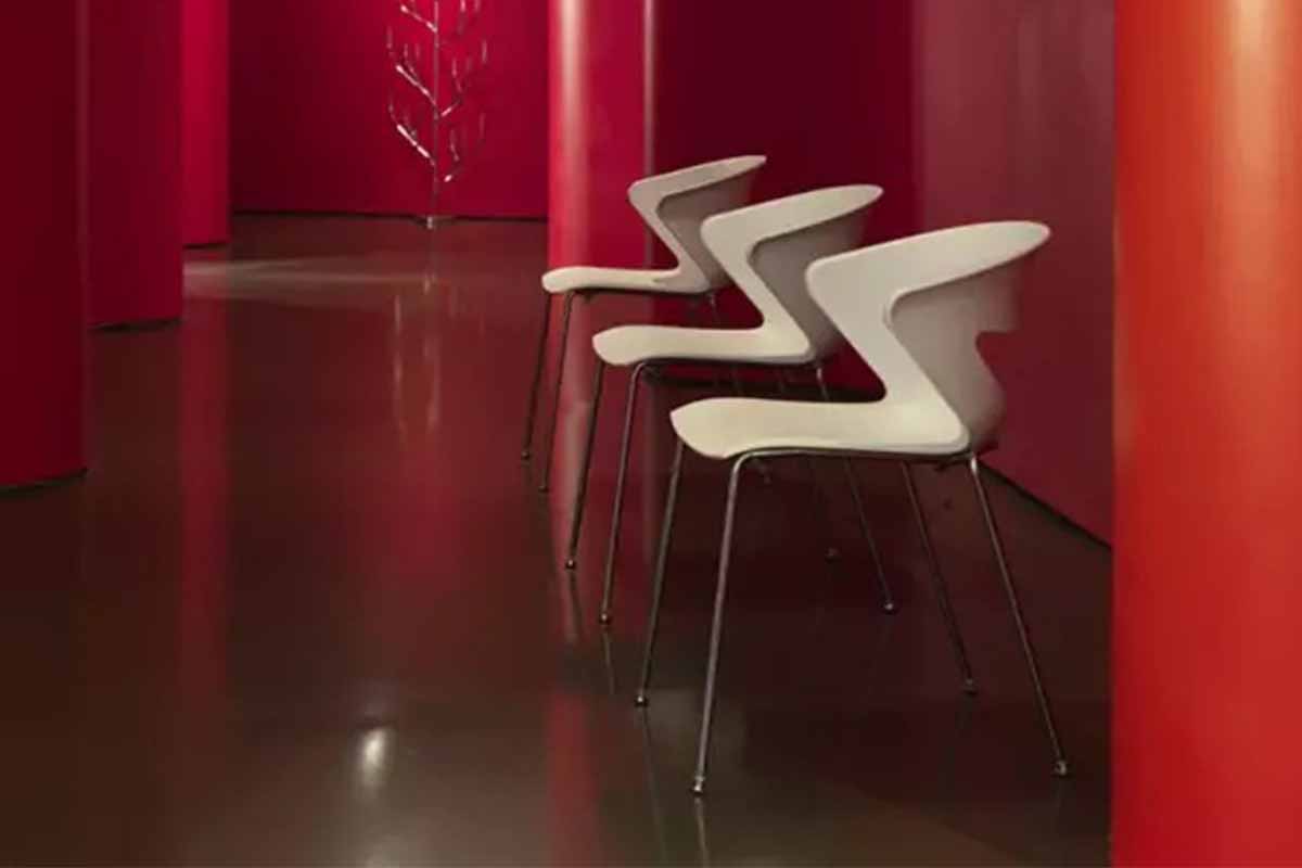
Colour combinations for furnishing in 2023 – kicca kastel chair – Arredare Moderno
How to use Colour Taupe?
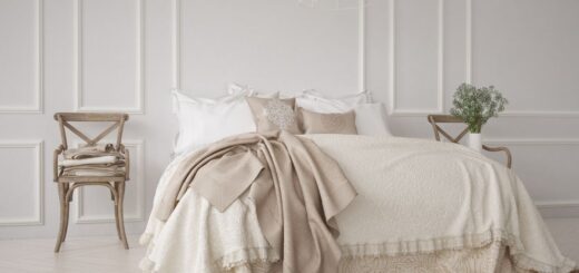
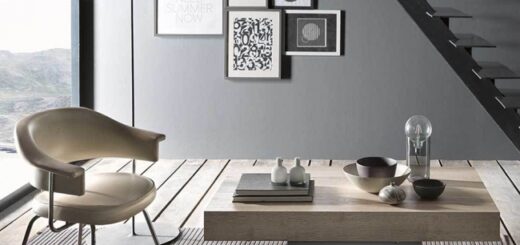
Colour Taupe, also known as dove grey, is a neutral colour that makes rooms look elegant. It is able to convey a sense of warmth and cosiness thanks to its different nuances, ranging from grey to beige to cream. It is also the perfect colour to use in furniture as a base for the whole flat, from the floors to the walls and the various elements that make up a room. Suffice it to say that it is perfect to combine with colours such as light blue, caramel and grey, and with natural materials such as wood. Nordic-style furniture made of wood, for example, characterised by soft shapes, is a perfect match for the neutral hues of Taupe, especially when used on walls or in combination with cushions and throws in the living room.
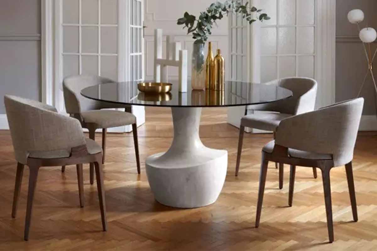
Colour combinations for furnishing in 2023 – velis pa potocco armchair – Arredare Moderno
The Very Pery and the different shades of purple
The Very Pery, Pantone colour of the past year, has been declined in every nuance to decorate home environments, from the brightest purple to lavender for those looking for romantic environments and contexts in which to live. It is still confirmed as a colour that can be used in a dominant manner in the home, from the entrance hall to the walls of the rooms. The ideal furnishing project involves using this colour, which in itself is romantic and full of personality, as a prominent element. Sofas and chairs in this hue are welcome, but so is simply a wall to make this glamorous shade stand out.
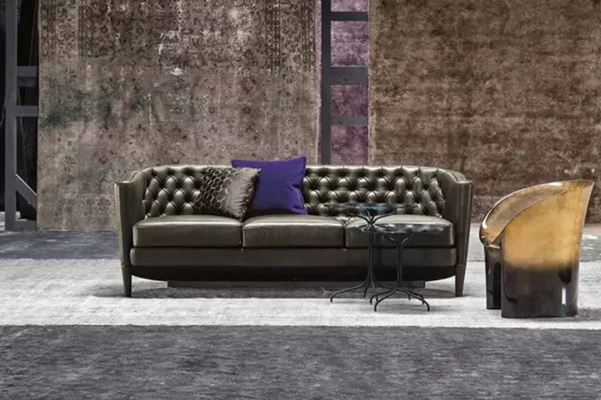
Colour combinations for furnishing in 2023 – rich moroso 2 and 3 linear seater sofa – Arredare Moderno
Green: the colour of nature
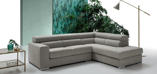
Green, which in itself represents the colour of nature, as it evokes flowering meadows and lush forests, can be used either on an entire wall or for particular details of a room. In the kitchen for example, in its mint green shade, it can be used as the colour of chairs, in the living room for the sofa, and in the bedroom as the colour for the carpet or bed cushions. Also, in its darker shade, known as undergrowth green, elegant and prestigious, it is perfect for use in the living room as the colour for an exclusive velvet sofa.
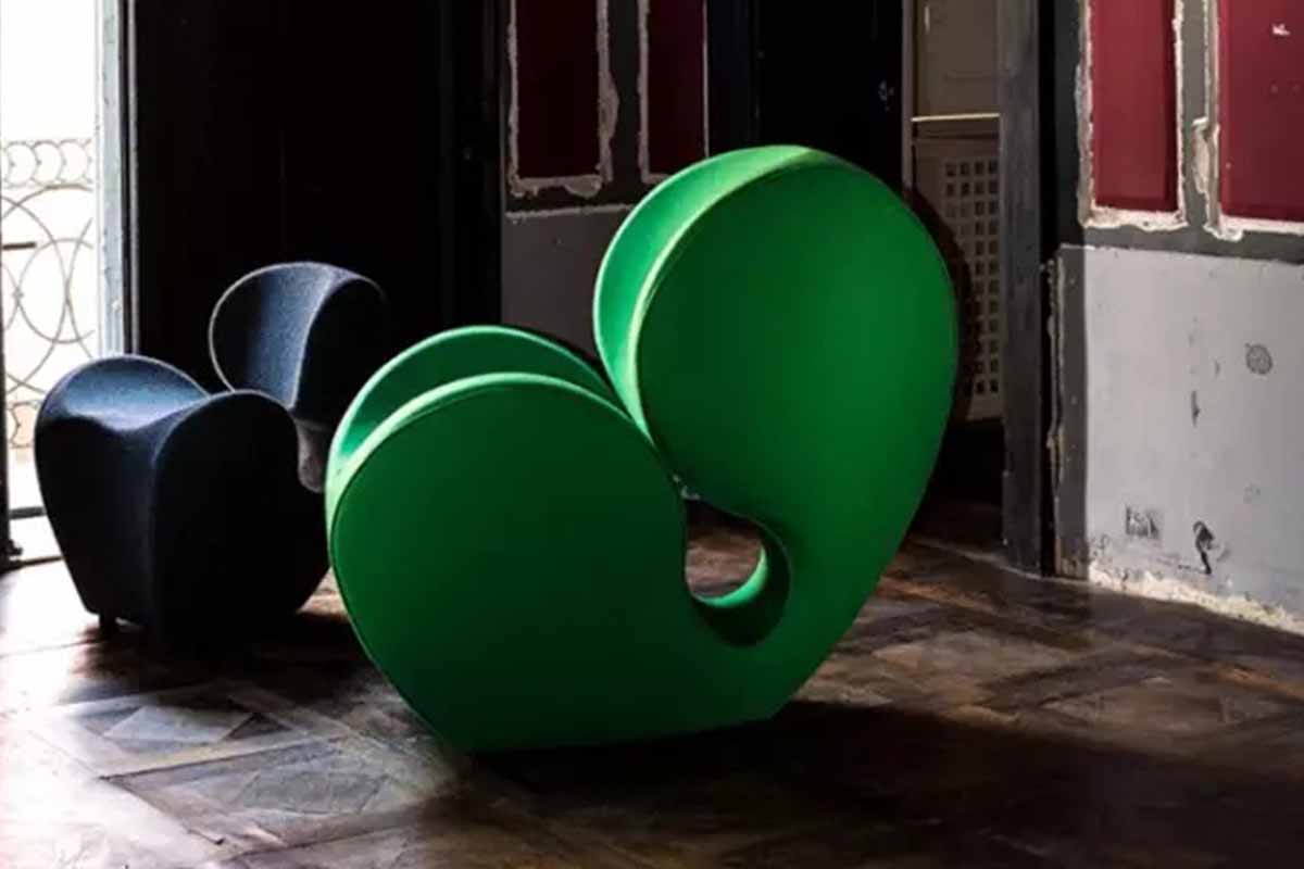
Colour combinations for furnishing in 2023 – soft little heavy soft big heavy moroso armchair – Arredare Moderno
The terracotta colour for a bold décor
Among the ideas for furnishing in 2023, there is no shortage of solutions that reflect a desire for change. In this case, the skilful combination of colours, between classic and neutral nuances, capable of giving the room a sense of calm and tranquillity, in contrast to bright and brash colours such as terracotta, is the ideal solution for those in search of energy and excitement. Suffice it to say that terracotta is one of the most popular and trendy natural colours in the world of interior design. Therefore, a kitchen in different shades of orange could be the perfect solution to bring a new positive energy into your home.
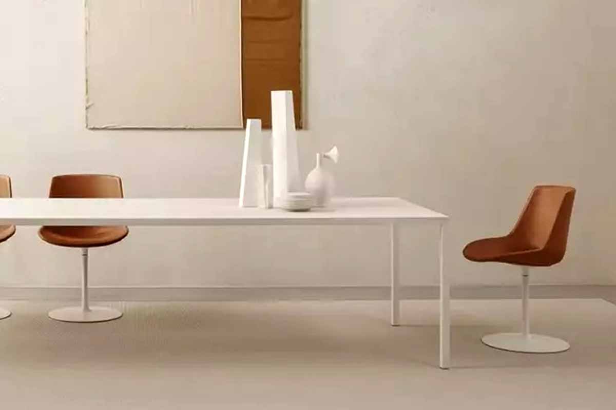
Colour combinations for furnishing in 2023 – flow leather mdf italia chair – Arredare Moderno
These are just a few examples of trendy colour combinations selected by Arredare Moderno to start the New Year with energy and positivity. Discover on the Blog everything you need for the impeccable furnishing of a trendy modern home. You can find everything you need to create a pleasant and functional environment that can make a difference.


