Chromotherapy for the home: guide and tips
Nowadays, the choice of colours for furnishing the home is no longer exclusively linked to an aesthetic value. The discovery of colour therapy, in fact, has spread greater awareness of the influence that colours can have on human actions. Here are some tips and ideas for applying colour therapy in the home.
According to colour therapy, a science in its own right, humans react differently depending on the colours they are in contact with. Here is some information on the qualities of the main colours and some tips for applying colour therapy in the home.
What is colour therapy?
Known as the science of colours, chromotherapy was invented in 1878 and is now considered a real science. Specifically, after a series of studies and scientific research, it was realised that colours can influence our body’s psychophysical well-being. The latter, in fact, if it comes into contact with certain colours, absorbing their light and radiation, is capable of reacting in different ways. Consequently, it is evident how colours enjoy different qualities and characteristics that can influence a person’s being, both mentally and physically.
Home Chromotherapy: guide and tips
How to apply colour therapy at home? Tips and hints
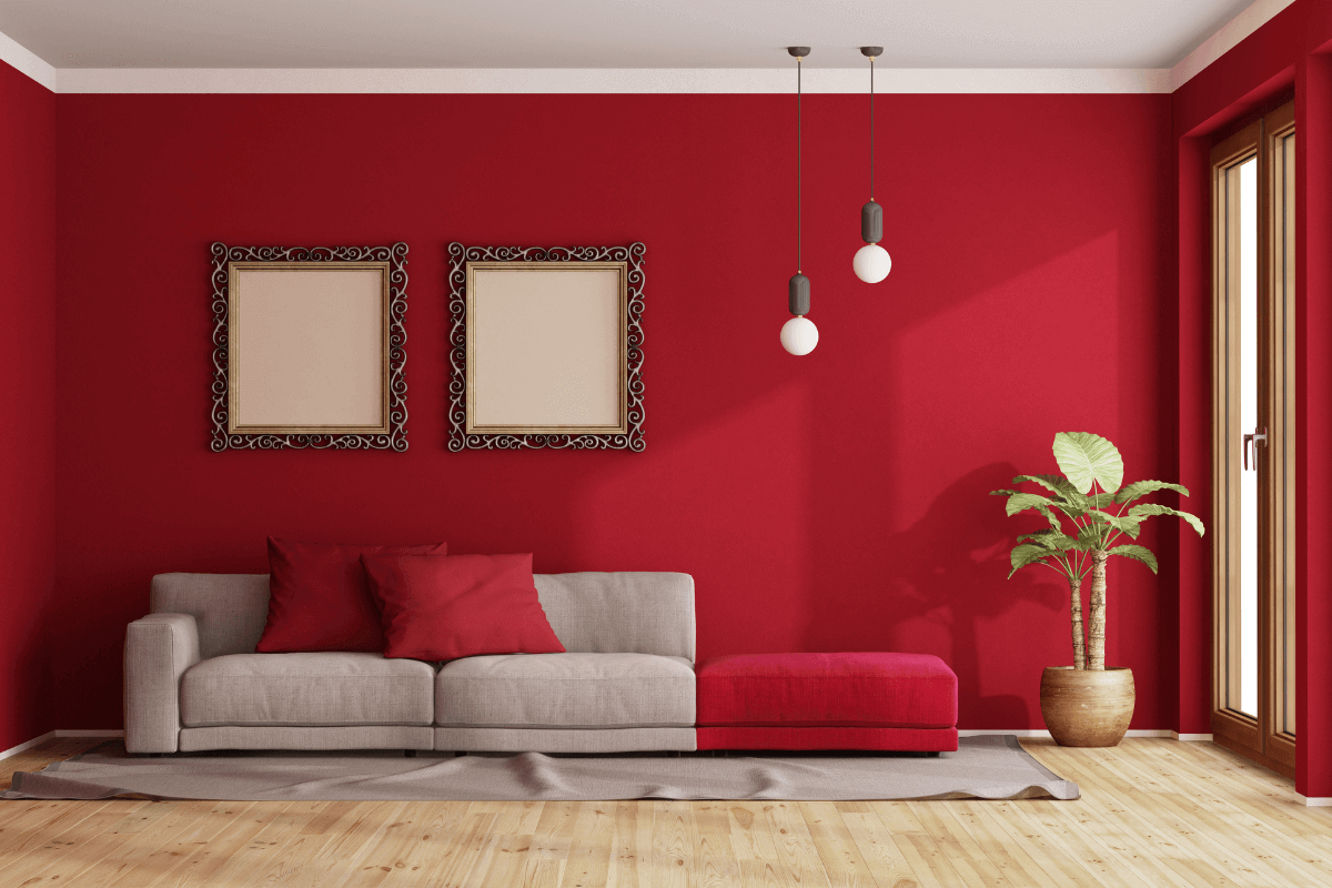
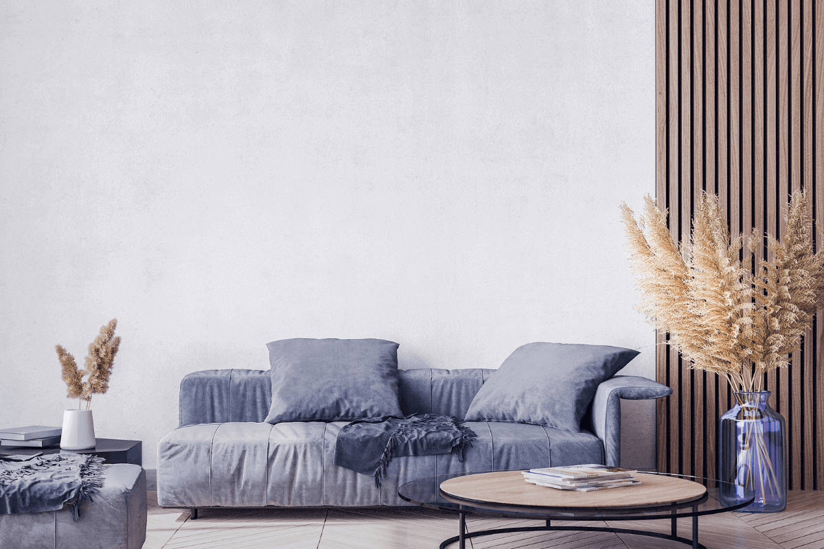
Applying colour therapy to home furnishing means influencing the psychophysical condition of the people living there in a positive way. First of all, before choosing shades, it is good to identify the function of the room in question and its structure. Specifically, the walls and floor are the places that have the fundamental impact on the person, as they are the first to fall on the eye. In general, for living areas such as the kitchen, dining room and living room it is good to opt for warm tones, ideal for giving energy and vitality. For the sleeping area, on the other hand, it is usual to choose cold colours, capable of giving the environment a sense of absolute relaxation and tranquillity, perfect for promoting sleep. Finally, for the children’s bedroom and the study, to encourage creativity and concentration, green, yellow or orange are perfect shades.
Home Chromotherapy: guide and tips
Cool colours: chromotherapy and quality
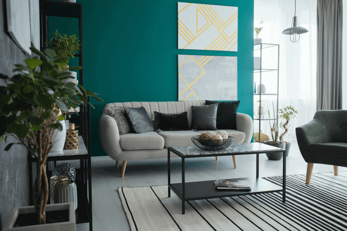
Cool colours boast the characteristic of bringing calm and tranquillity to environments. Specifically, the main colours include blue, green and violet. Blue, the quintessential symbol of the sea and sky, is a colour that can give a very relaxing and calm effect. The hue can induce freshness and serenity in life, communicating a strong sense of reflection and inner peace. Green has the ability to give a soothing and relaxing effect and, moreover, precisely because it is the chosen colour of nature, it is ideal for creating and enhancing the bond between man and the natural element. Finally, violet is a colour generally used for the sleeping area, as it is able to promote relaxation of the psyche and sleep.
Home Chromotherapy: guide and tips
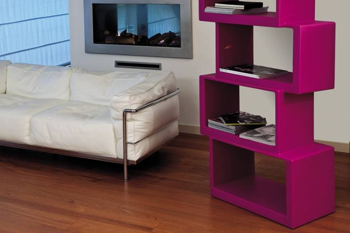
Meta 21st Twentyfirst Livingart Bookcase
Made entirely of lacquered polyethylene and available in a variety of finishes, the Meta 21st Twentyfirst Livingart bookcase is characterised by a modern, elegant design. Its linear and well-defined forms make the article extremely versatile and ideal for any room in the home.
Meta 21st Twentyfirst Livingart Bookcase
Warm colours: colour therapy and quality
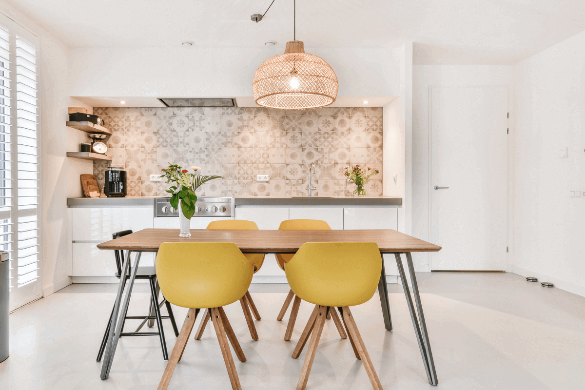
The main and most widely used warm colours in furniture are red, yellow, orange and pink. Red is a very expressive and lively shade, capable of attracting attention and igniting rooms with vitality. Yellow, on the other hand, is the colour par excellence of light and sunshine. The latter shade is also capable of conveying positivity, energy and hope. It is followed by orange, an absolutely intense warm colour, born from the collision of eccentric red and energising yellow. Orange is also a colour capable of stimulating warmth and energy and, moreover, one of its chromatic properties is to stimulate human concentration. Finally, pink is the quintessential feminine colour. The shade is capable of conferring a sense of extreme elegance and delicacy and instils confidence and positivity.
Home Chromotherapy: guide and tips
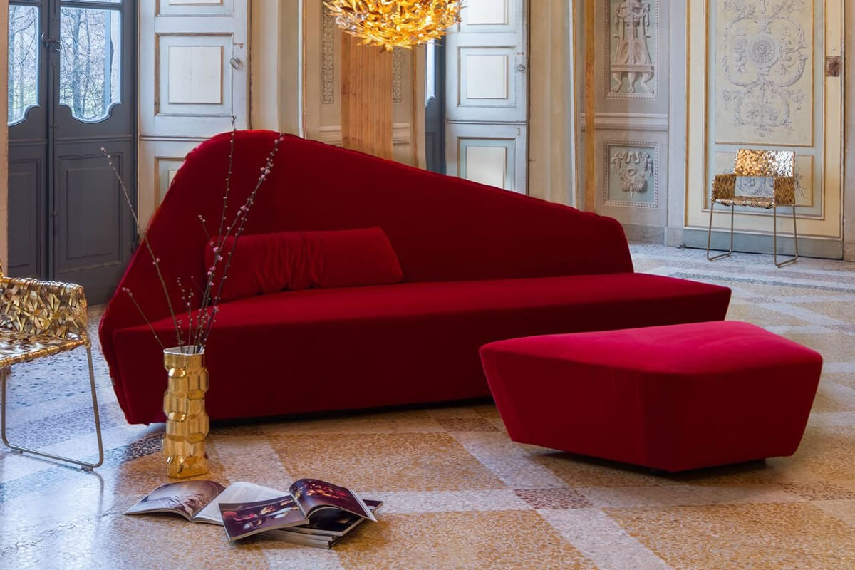
Driade Verlaine Sofa
One of the most interesting design proposals in the Arredare Moderno catalogue is the Verlaine Driade sofa. It is a project entirely designed by designer Lievore Altherr Molina and stands out for its high class, elegance and uniqueness. Specifically, the structure is made of polimex and mdf, with wooden feet and upholstery available in different finishes. The sofa with pouf is of great versatility and aesthetics, ideal to enhance any type of furnishing style.
Verlaine Driade Sofa
Black and white: chromotherapy of the two chromatic vertices
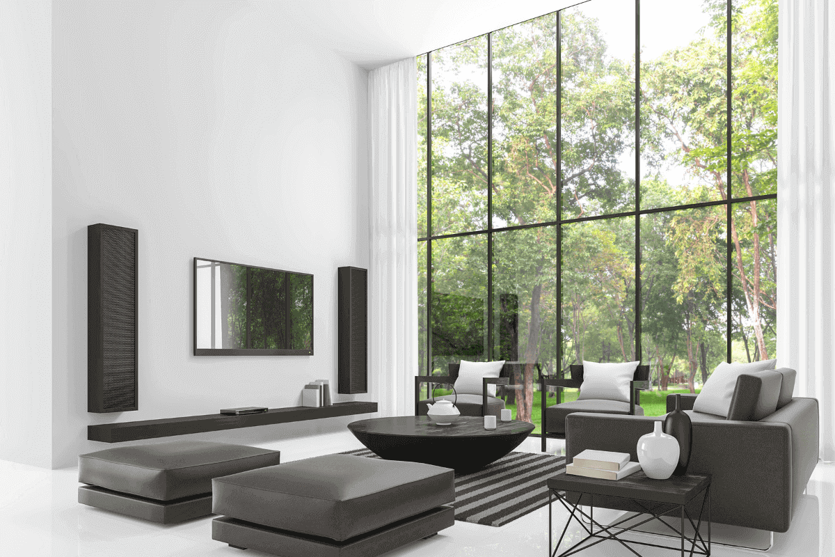
White and black are the colour shades that have always been most widely used for home decoration. Although they have different qualities and characteristics, they are two absolutely versatile and aesthetically elegant colours. As far as black is concerned, this symbolises first and foremost the colour of night, so it is the shade of darkness and mystery, but also of the fascination of the unknown. In general, the colour is synonymous with sadness, although in interior design, the class that black gives the surroundings is undeniable. On the other hand, white is the favourite colour of purity and order. It is the light shade par excellence, capable of making an environment brighter, cleaner and more airy from an optical point of view.
Home Chromotherapy: guide and tips
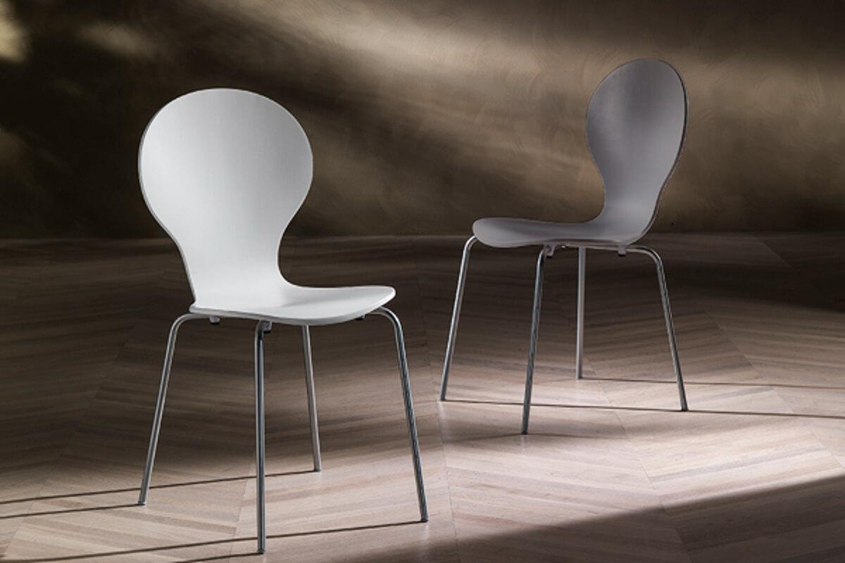
Baldi Tomasucci chair
Among the proposals present on the Arredare Moderno site, the Baldi Tomasucci chair is characterised by a metal structure where both the seat and back are painted white. With simple lines and shapes, this is an elegant chair that can be adapted to any type of furnishing.
Baldi Tomasucci Chair


